Visual Identity
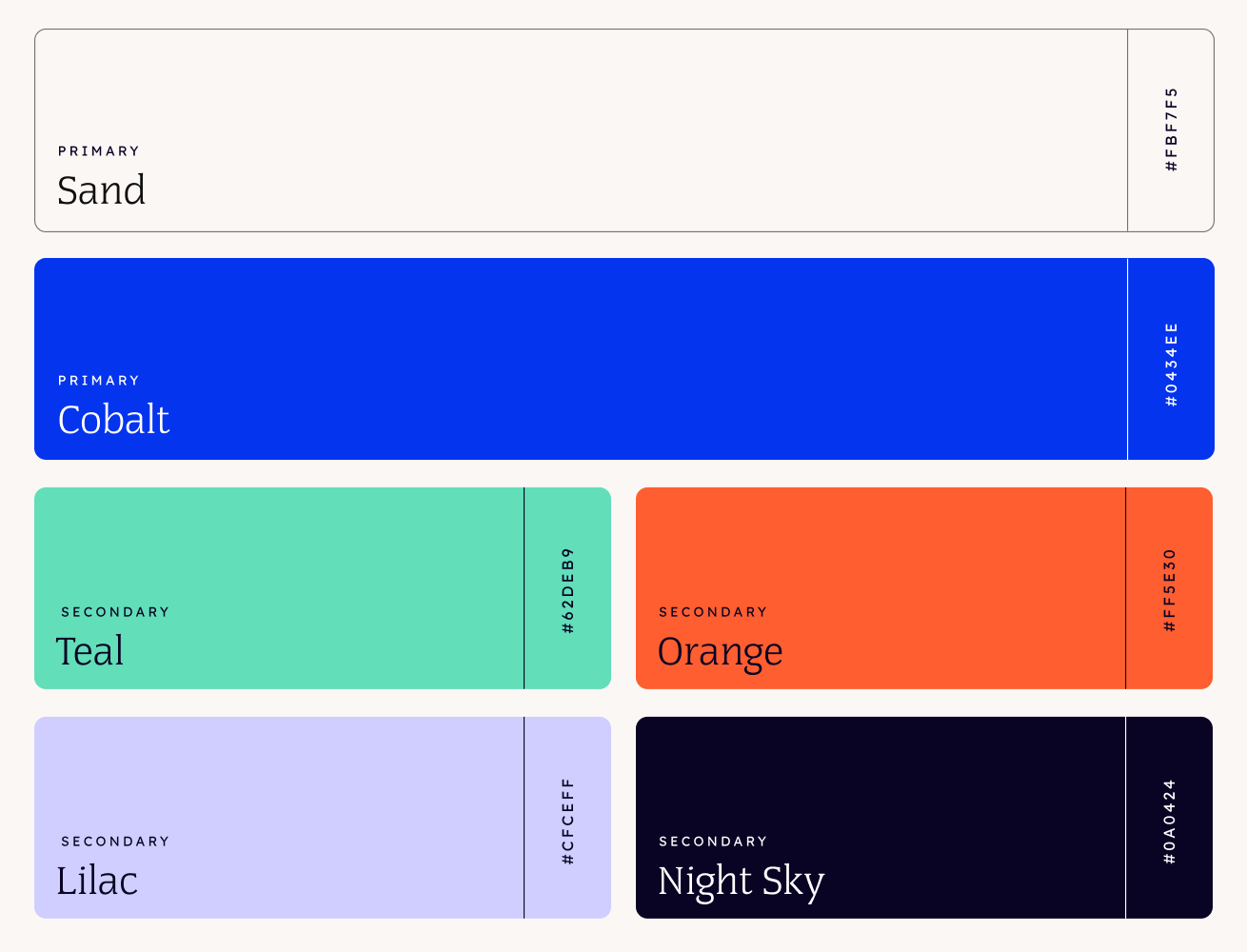
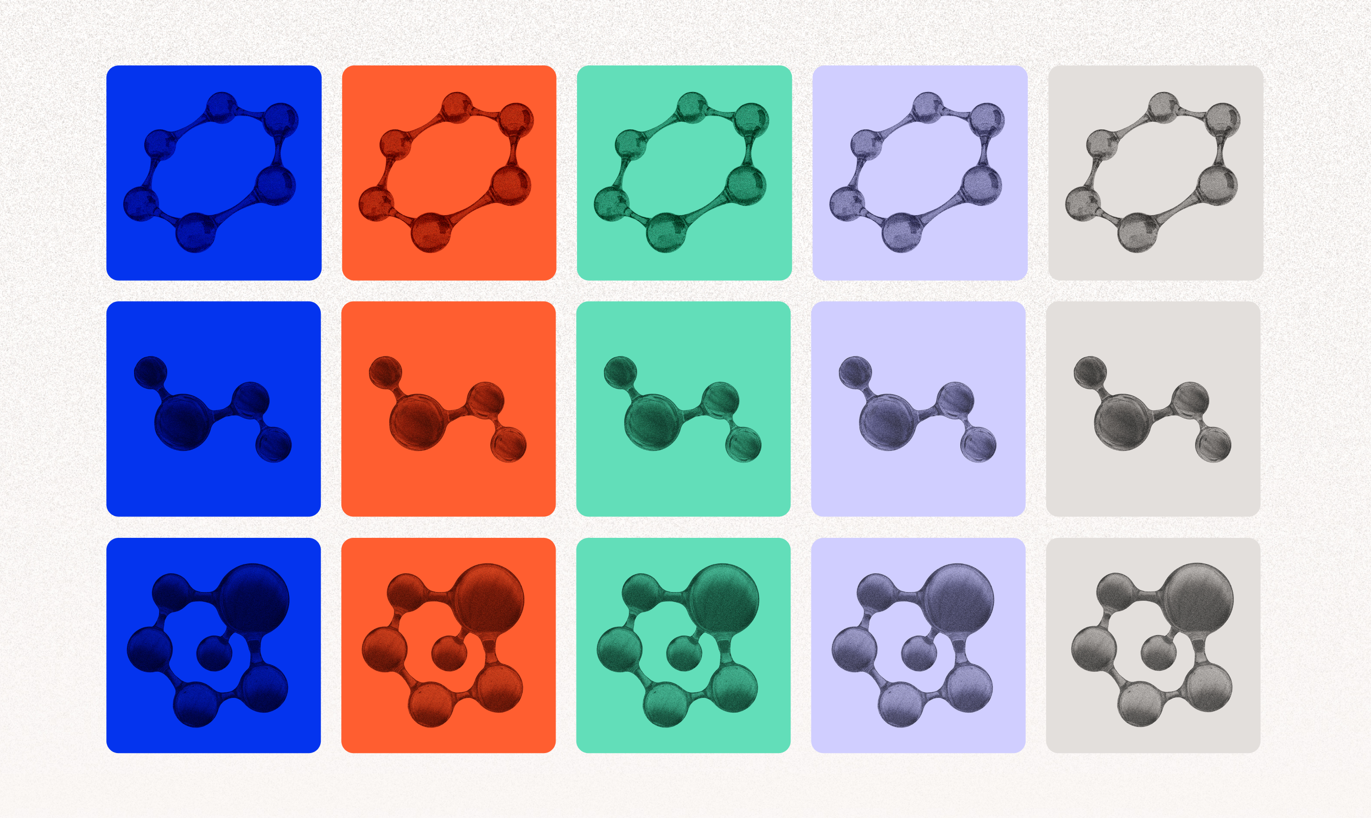
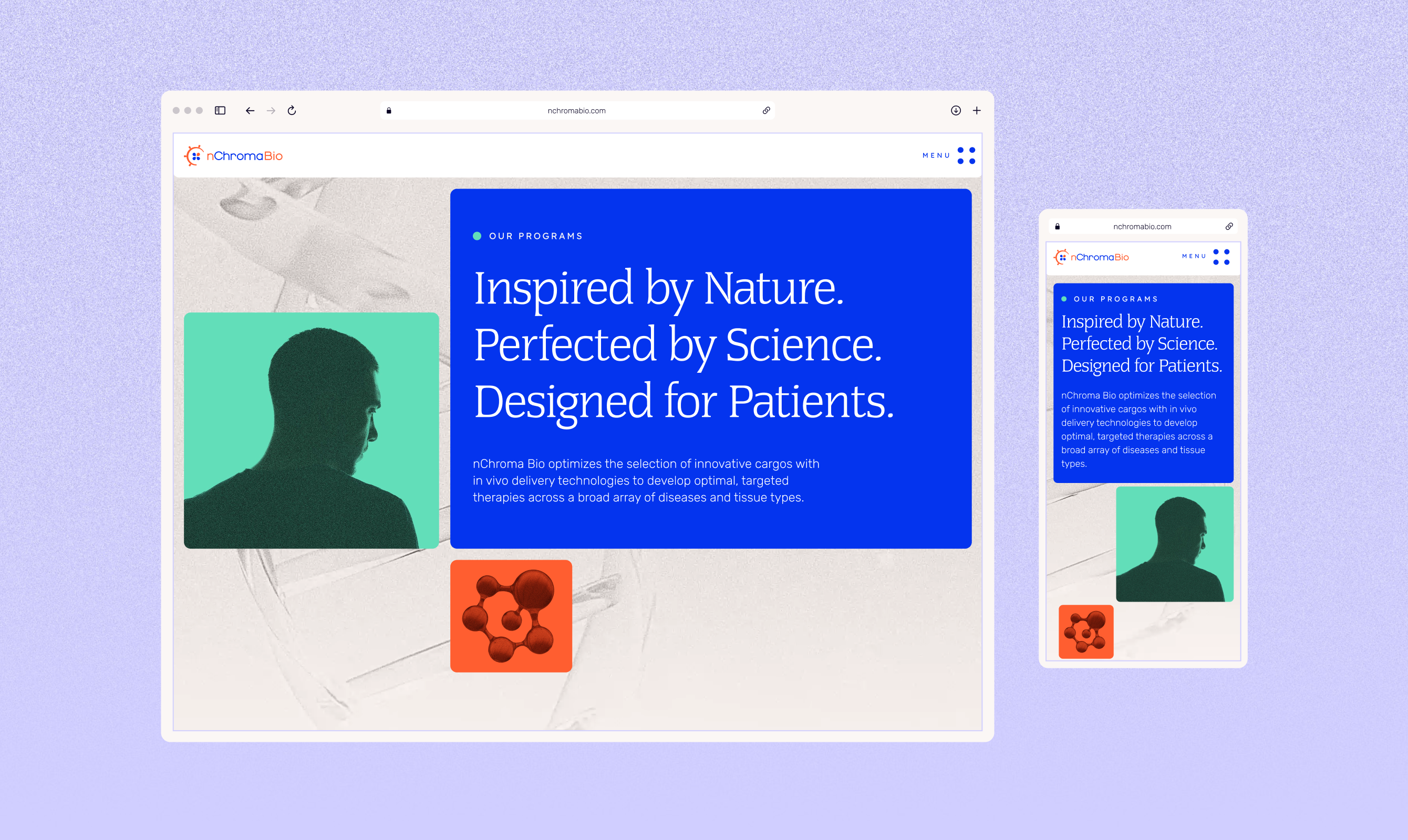
In a field where biotech competitors default to dull, blue monochromatic palettes, nChroma Bio was looking for an unconventional visual identity to stand apart. The new identity solves this with bold Cobalt and Night Sky grounded by vibrant Red Orange, Teal, and Lilac accents, paired with Congress typeface, a high-contrast serif that gives an editorial, sophisticated feeling, while Rubik and Lexend keep body copy clean and legible.
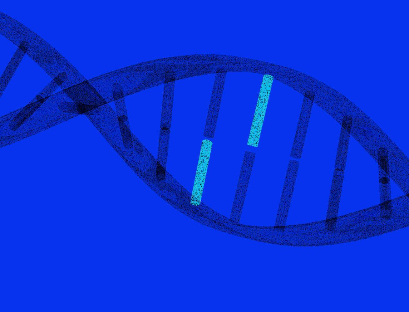
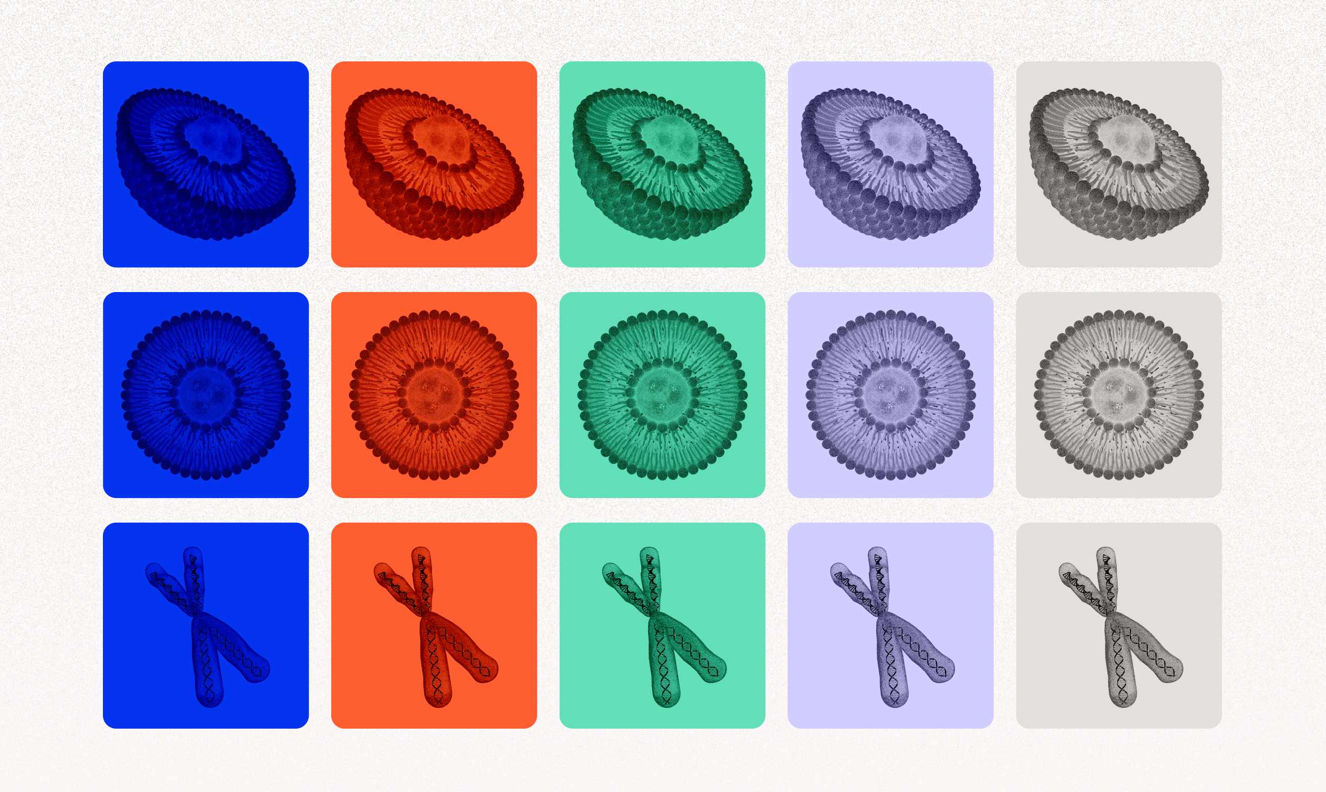
A custom library of molecule, DNA, and chromosome graphics forms the scientific visuals backbone — stylized and consistently rendered across the palette. Stylized patient silhouettes, in the same color treatment, introduce human presence without tipping into overly clinical territory.




Digital Experience
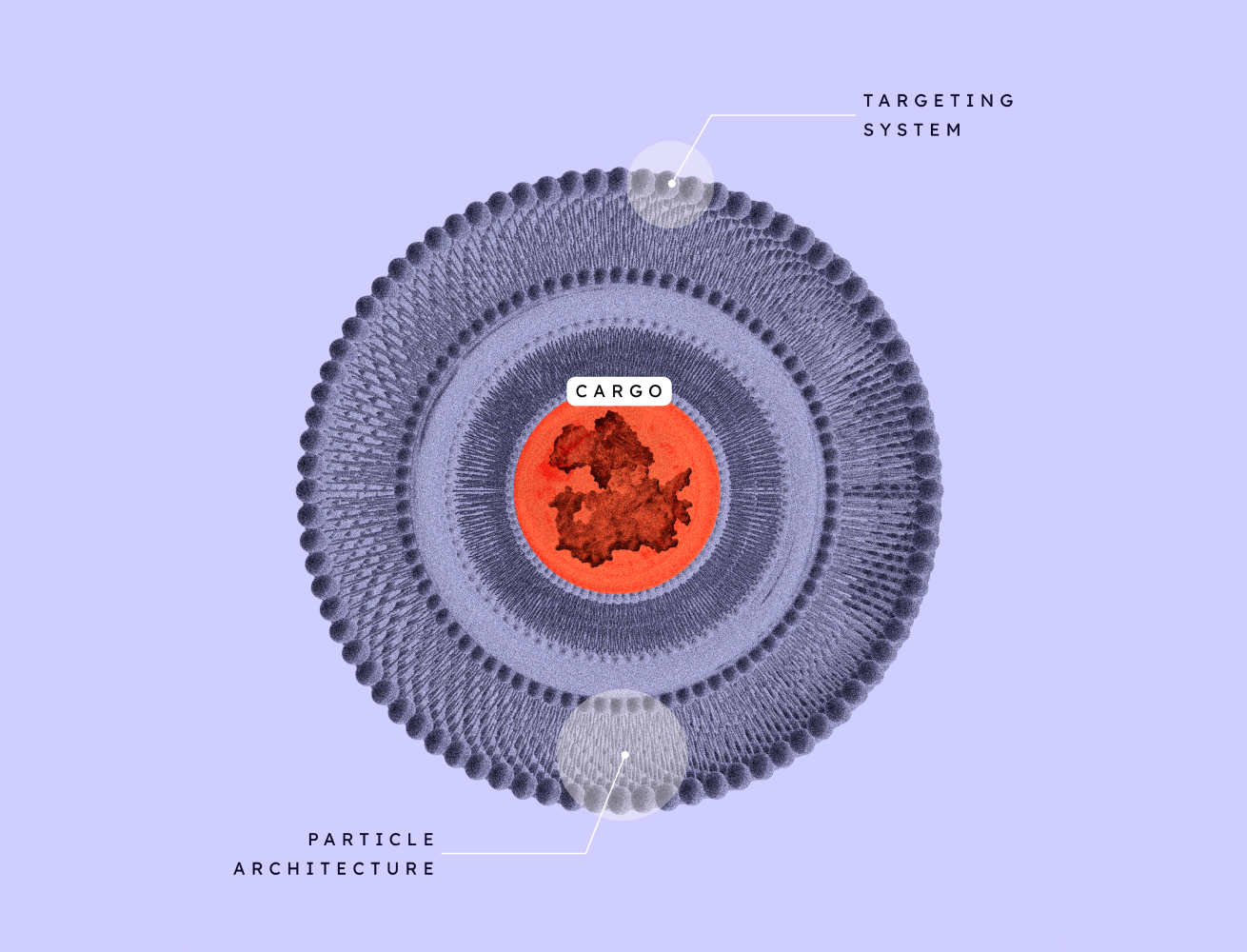
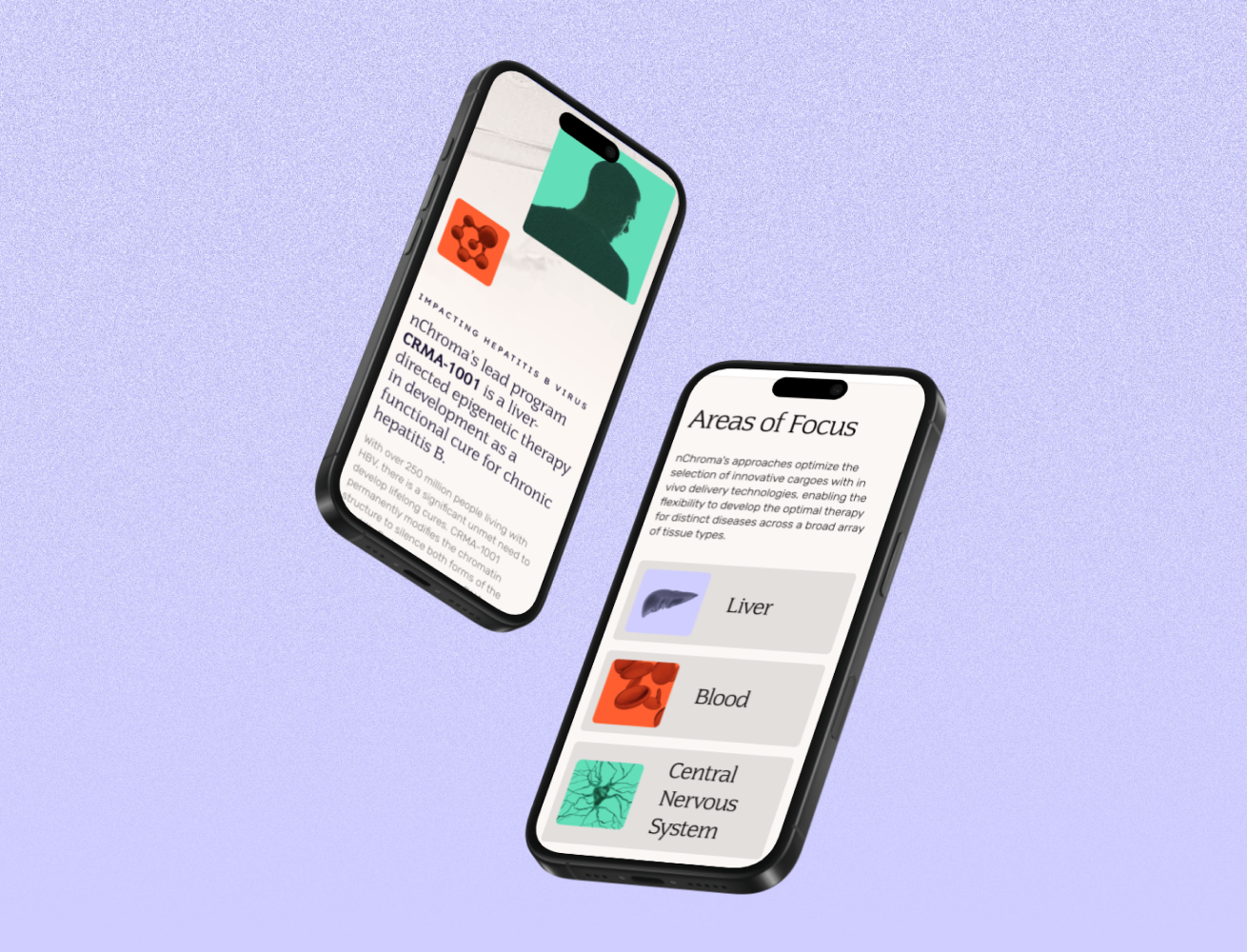
The site holds two audiences at once — investors who need to quickly understand who nChroma Bio is as a company, and job seekers who need to connect to the work culture. Structured layouts and deliberate negative space frame the science with intention, while subtle motion and dynamic stacking cards guide users through complex concepts without feeling chaotic.
A rethought pipeline — organized by focus area rather than a dated timeline — makes the science feel as forward-thinking as the medicine itself.



credits
Creative Direction: Adam Gesuero
UI Design: Danielle Sharples
Project Management: Christine Page
UX & Strategy: Katie Bumatay
Art Direction: Danielle Sharples
Account Management: Christine Page
Motion Graphics: Danielle Sharples
Development: Adam Riggs
