
Visual Identity
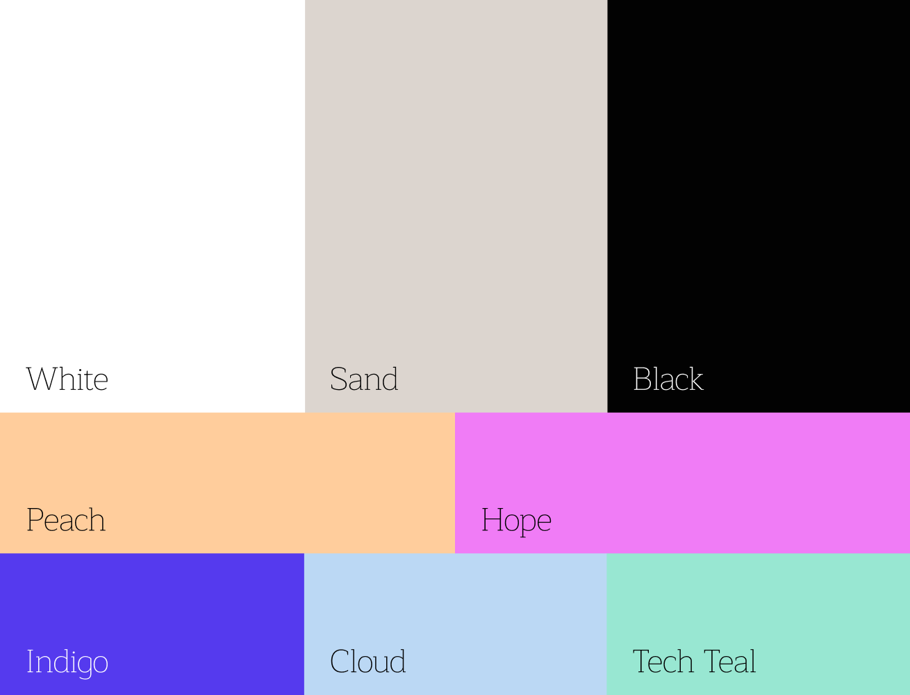
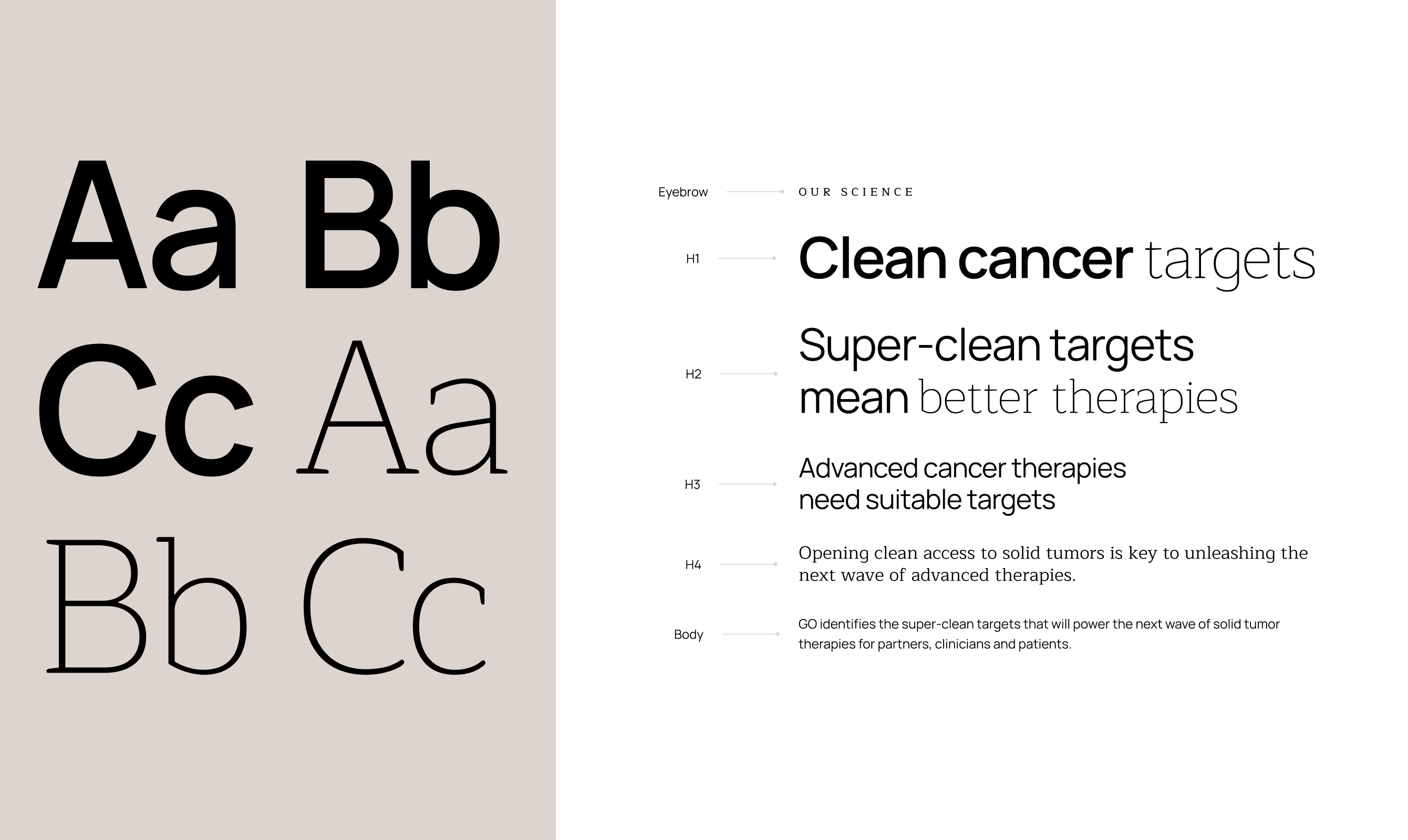
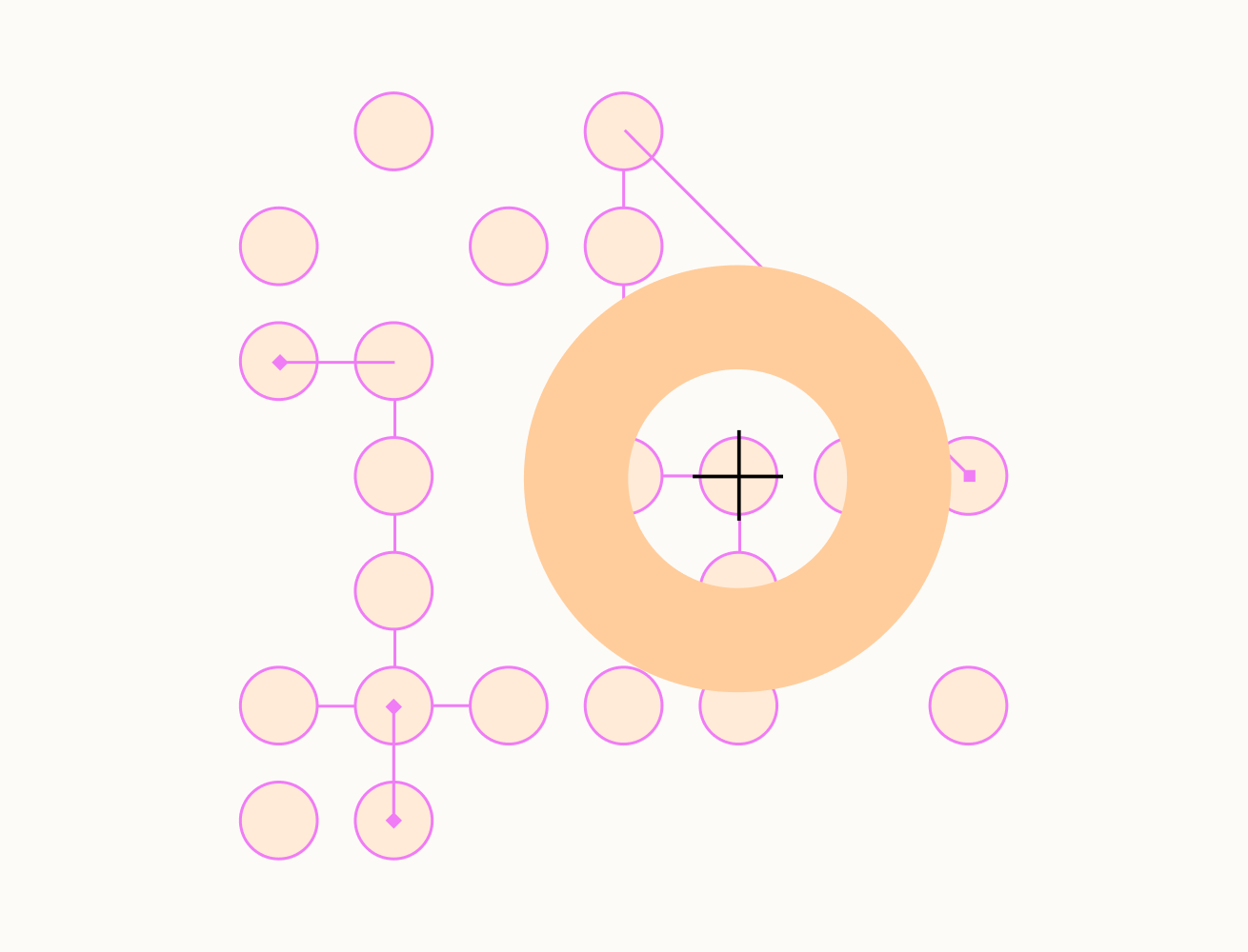
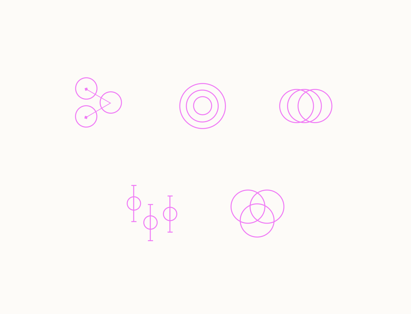
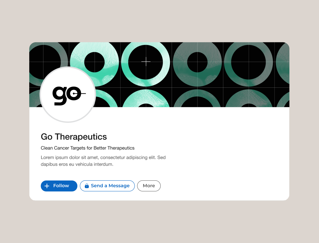
The visual language for Go Therapeutics embodies precision targeting through abstract cellular textures and node-link structures representing their glycan-based mechanisms. A distinctive color palette breaks from industry blues, using vibrant primaries balanced with warmer tones to convey both scientific accuracy and hope.
Minimalist layouts with strategic white space focus attention on scientific narratives, while custom graphics translate complex biological processes into clear visual storytelling—all reinforcing Go's mission of targeting cancer cells while sparing healthy tissue.

Logo Design
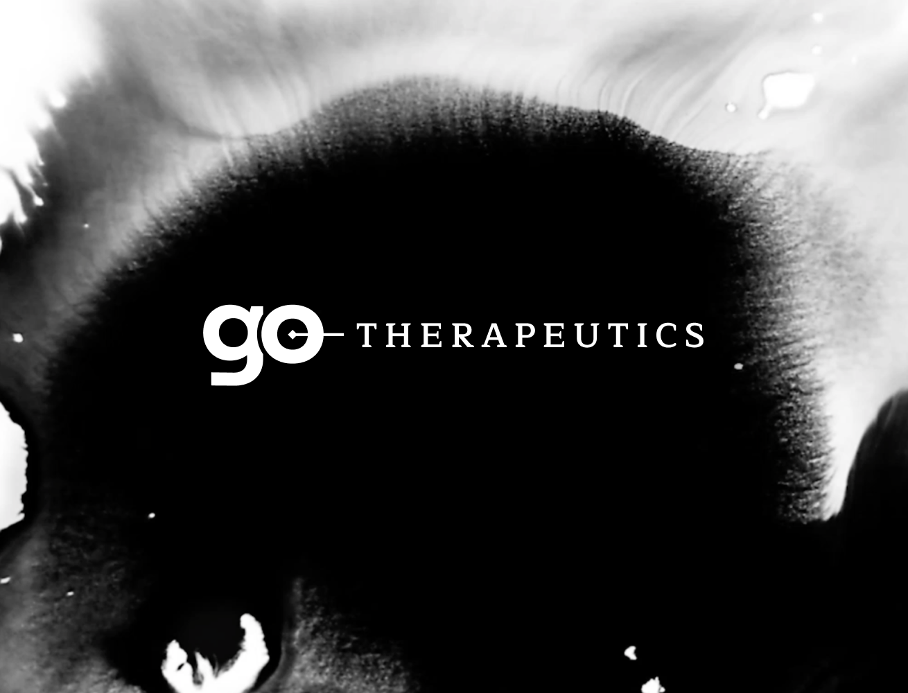
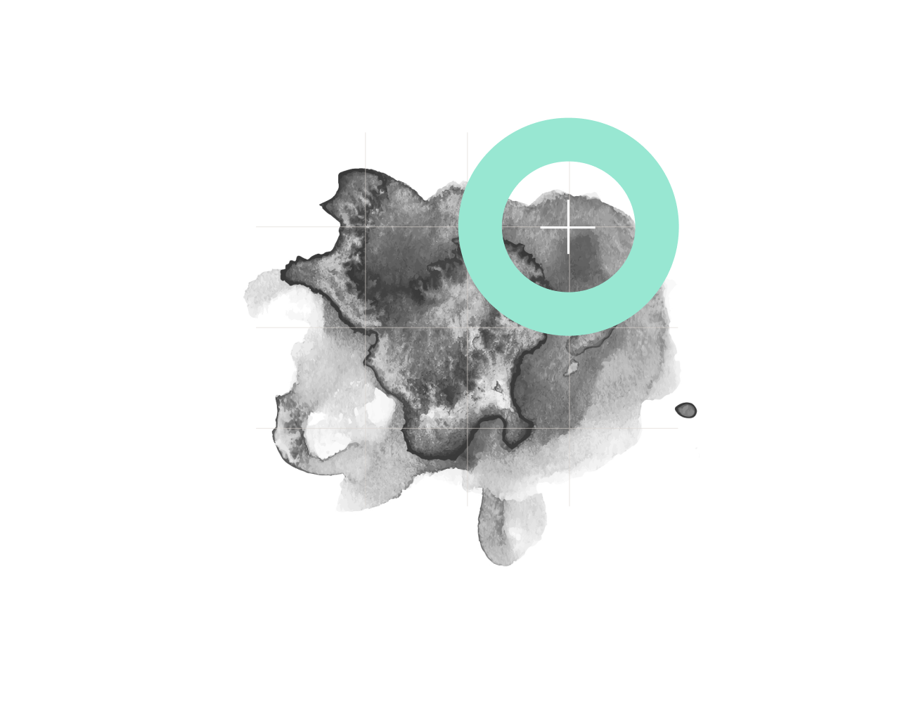
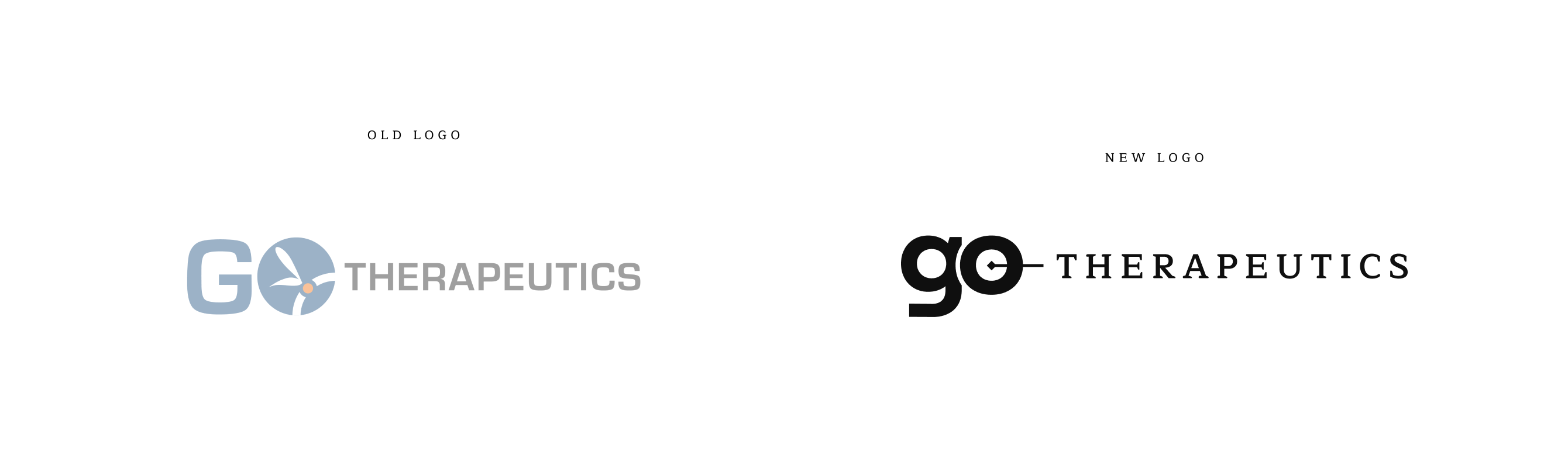
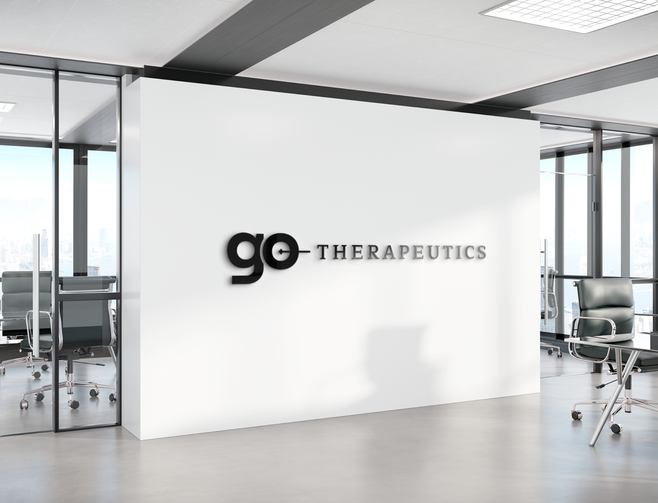
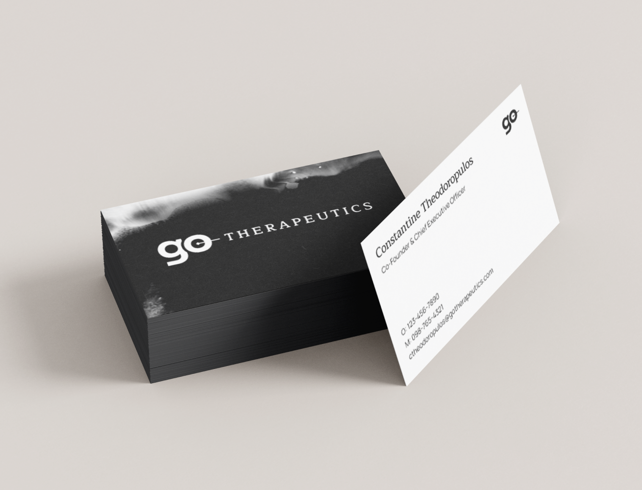
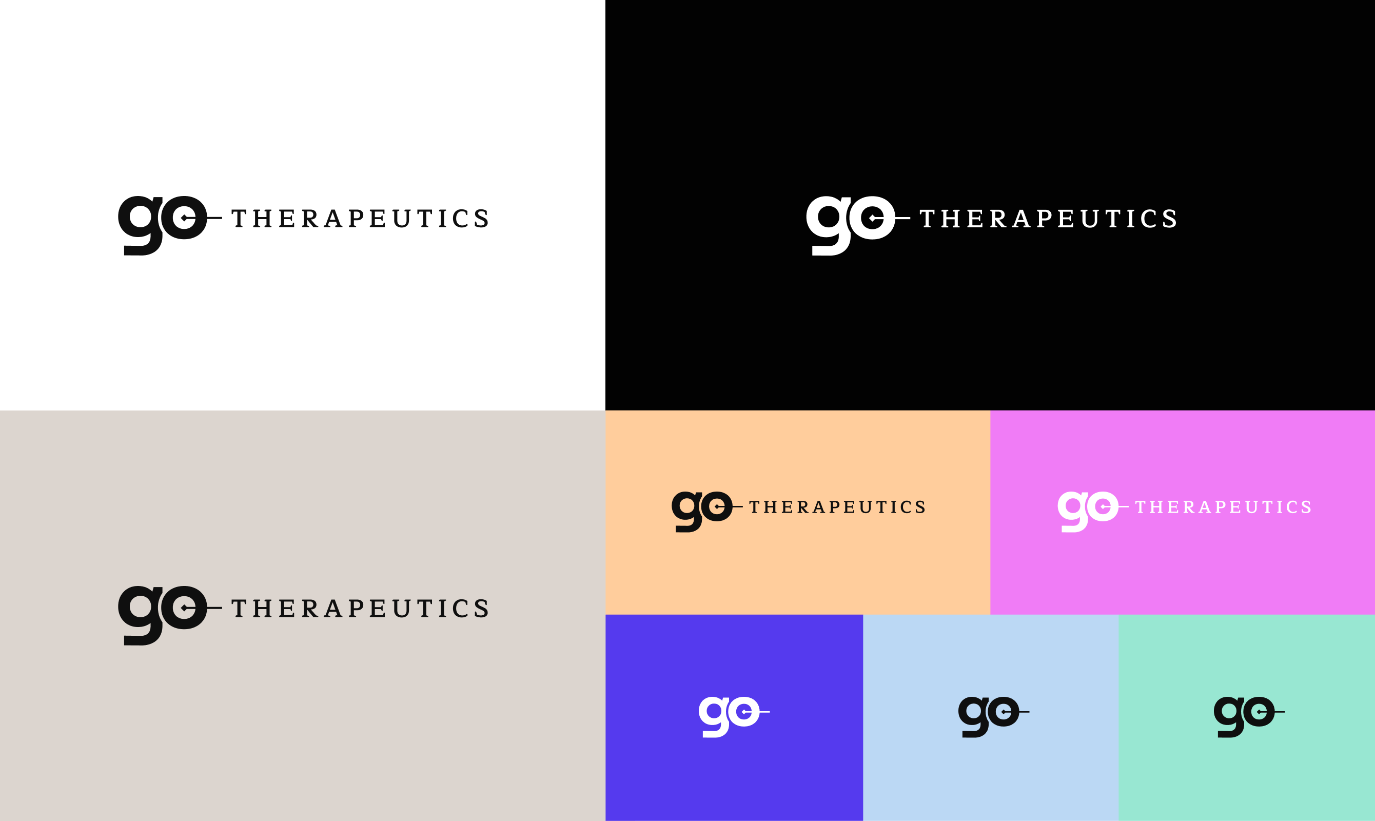
The new Go Therapeutics logo embodies the company's mission of precision-targeted cancer therapies. The bisected circle within the 'o' serves as a crosshair motif, symbolizing pinpoint accuracy in identifying and attacking cancer cells while minimizing impact on healthy tissue.
The balanced contrast between the modern lowercase 'go' and classic serif 'Therapeutics' visually expresses the brand's innovative approach grounded in established scientific principles.
Digital Experience
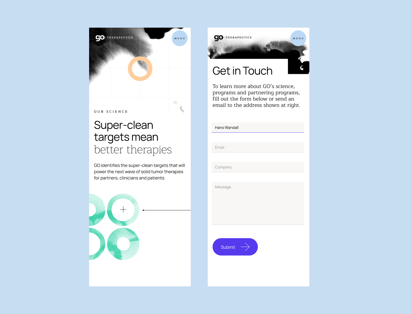
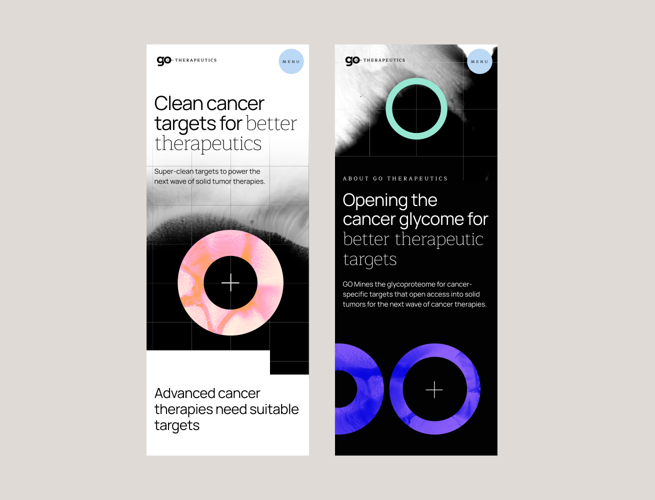
The digital experience needed to communicate complex scientific concepts without overwhelming users. We crafted an interface where purposeful motion reveals content much like Empress reveals therapeutic molecules in the human body, with intention and clarity.
Throughout the experience, interactive elements maintain a delicate balance: sophisticated enough to reflect cutting-edge science, yet intuitive enough to make revolutionary concepts accessible.
credits
Creative Direction: Adam Gesuero
UI Design: Danielle Sharples
Project Management: Christine Page
UX & Strategy: Katie Bumatay
Art Direction: Danielle Sharples
Account Management: Christine Page
Motion Graphics: Danielle Sharples
Development: Adam Riggs