

Visual Identity
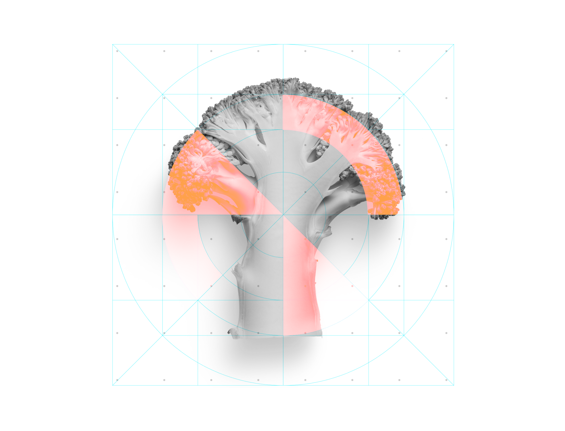
The reimagined Empress visual identity draws power from their signature dot-grid motif, transforming it from a simple pattern into a visual metaphor for molecular discovery. By layering this geometric foundation with authentic human imagery, we created a visual narrative that bridges scientific precision with human impact.
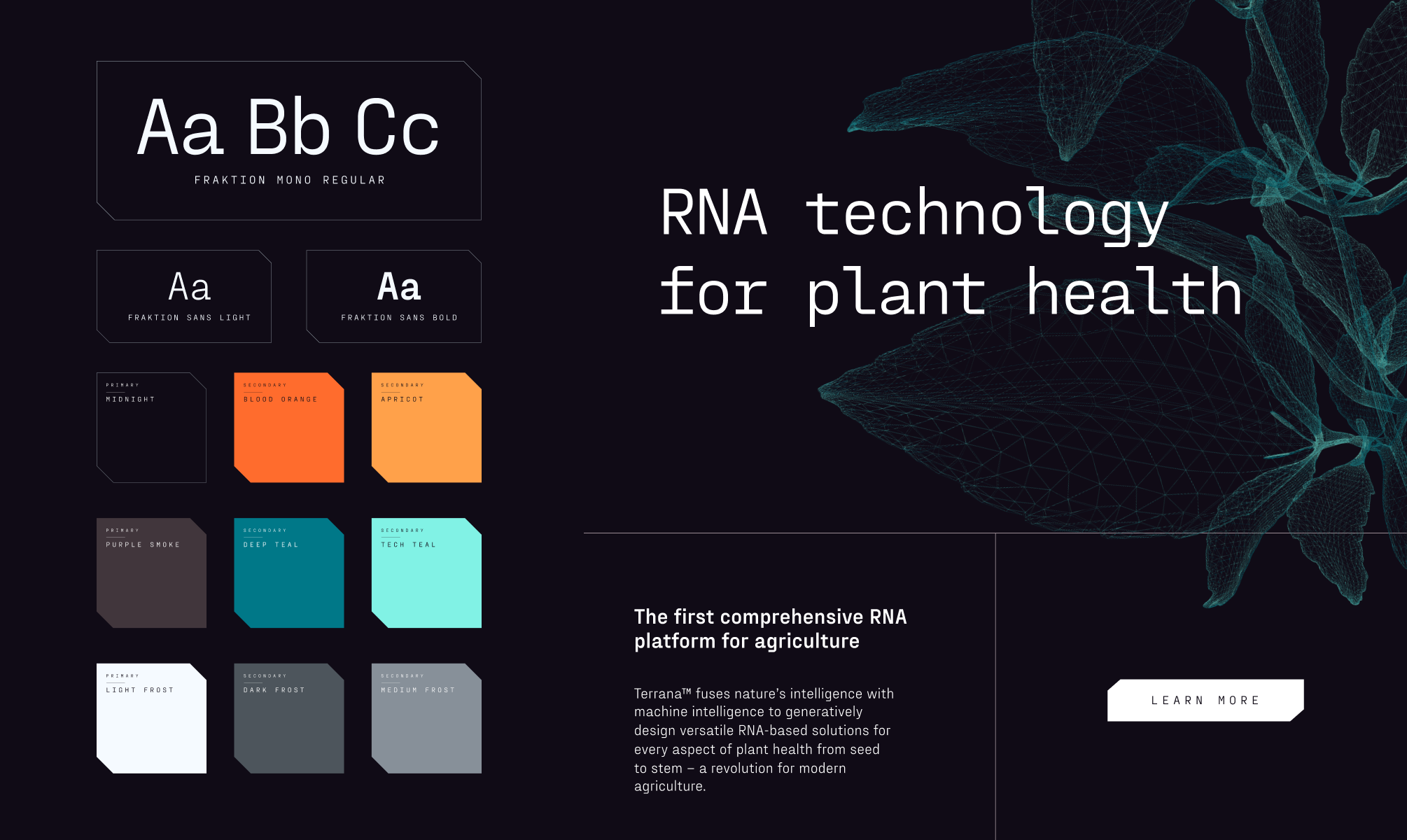
The vibrant teal palette pulses with energy throughout the experience, complemented by a typography system that balances technical clarity with bold confidence—reflecting a company that's revolutionizing drug discovery ten times faster than traditional approaches.


Logo Design
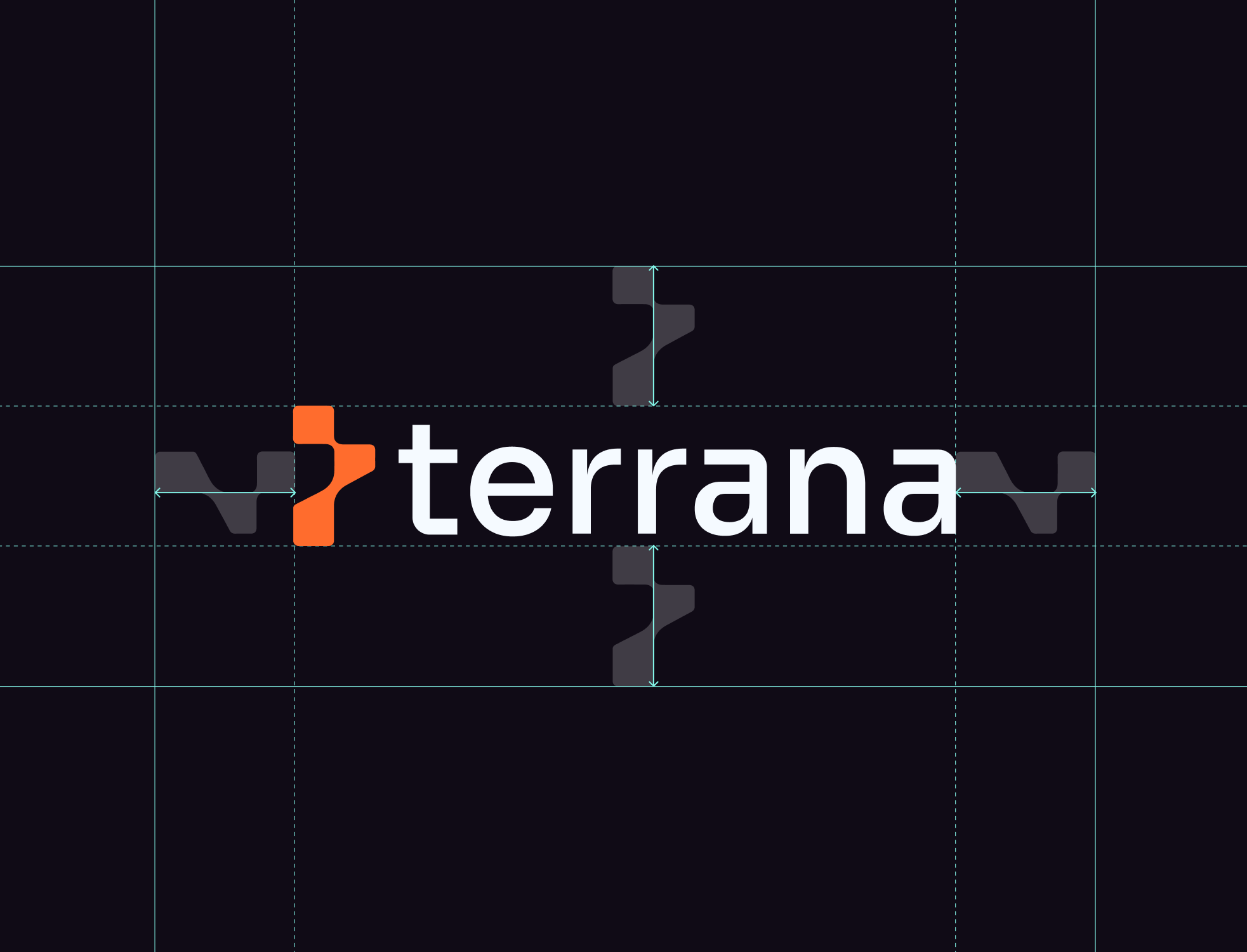
The Terrana wordmark is confident and modern, designed to feel engineered yet grounded. Geometric letterforms convey structure and intent, with subtle nuances that reflect the brand’s blend of scientific rigor and approachability.
It’s a mark that resists cliché biotech symbols while signaling a future-forward identity built on clarity and trust.


Digital Experience
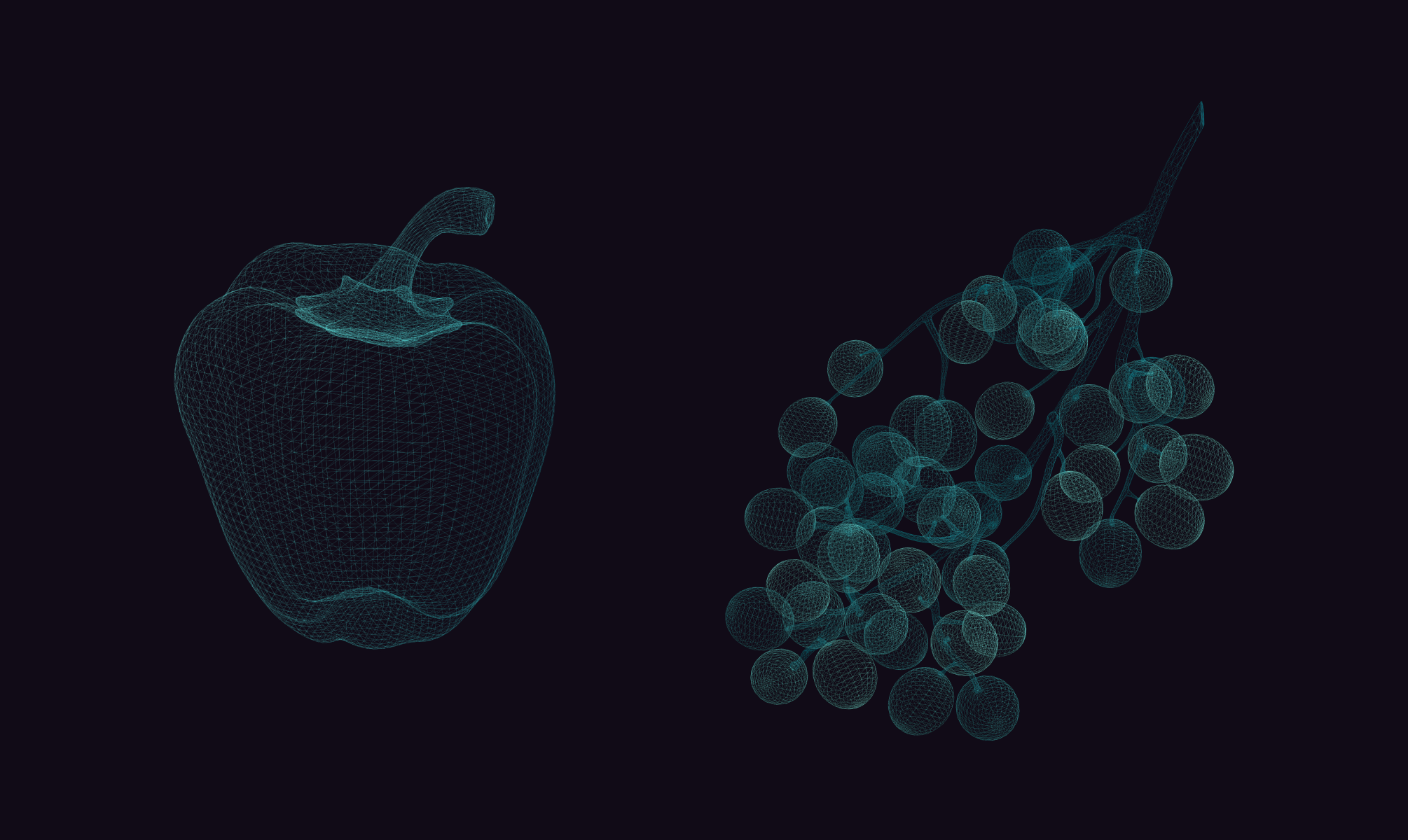
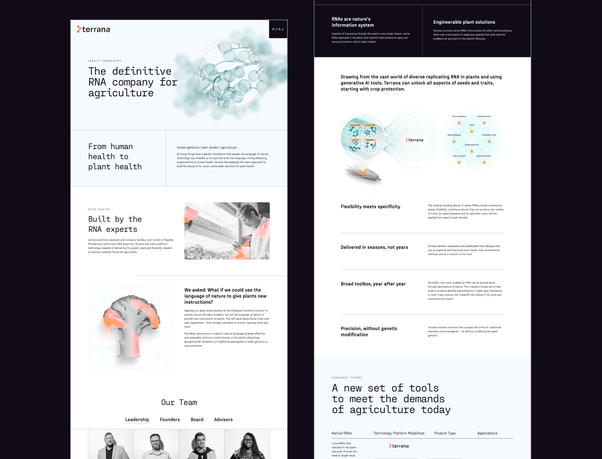
The website introduces Terrana’s science through purposeful motion and clean, responsive layouts that guide users from intrigue to understanding. Interactions are designed to evoke a sense of engineered precision—hover effects that hint at pixels snapping into place, transitions that deconstruct and reassemble, and layered imagery that invites users to “look closer.”
The result is a digital experience that humanizes complex science, attracts top talent, and builds credibility with partners and investors alike.